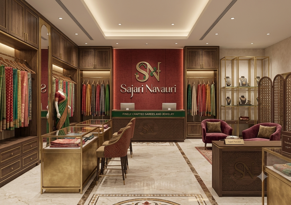
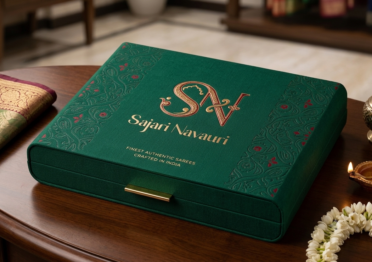
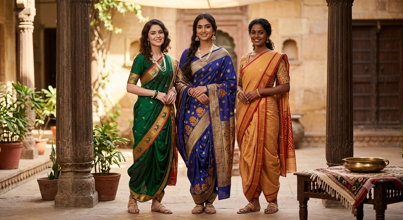
Case Study

Sajari
Navauri

A complete brand universe built for a luxury heritage saree and jewellery label — rooted in Indian tradition, crafted for modern discernment.

Logo & Brand Identity Social Media Marketing Website Design
Sajari Navauri
Luxury Fashion
Brand Identity, Web, Social
2025
Sajari Navauri luxury store interior with brand signage
SN

Sajari Navauri

3
Core Services Delivered
4
Brand Colour Variants
8+
Mockup Applications
100%
Client Satisfaction
Sajari Navauri primary logo
Brand Synopsis

Where Heritage Meets Heirloom

Sajari Navauri is a premium South Asian bridal and festive wear label specialising in handcrafted silk sarees and artisanal jewellery. The brand needed an identity as timeless and layered as the garments it creates — one that speaks equally to tradition-rooted brides and modern fashion connoisseurs.

Luxury Positioning

Premium, culturally-rooted identity crafted for discerning buyers of heritage fashion.

Cultural Authenticity

Mughal and Rajasthani architectural motifs woven into every brand touchpoint.

Digital-First Presence

Fully responsive web presence and social-ready brand assets for modern audiences.

Timeless Elegance

Typography and motifs selected to remain relevant across decades, not just seasons.

Client Requirements

What the Client Needed

Before a single mark was drawn, we listened. Here is what Sajari Navauri brought to the table.

"We want something that feels like heirloom jewellery in visual form — rich, layered, unmistakably Indian, and yet sophisticated enough to grace international platforms."

— Sajari Navauri, Founder

Logo & Brand Identity

A monogram logo merging cultural motifs with classic typography, with multiple colour-way variants for different applications.

Social Media Branding

Consistent templates and a content visual language suited for Instagram, Facebook, and Pinterest marketing.

Responsive Website

A mobile-first, visually opulent e-commerce ready website that reflects the brand story and drives conversions.

Packaging & Collateral

Brand mockups across visiting cards, packaging boxes, hang tags, and promotional merchandise.

Our Approach

The Creative Process

Every element was researched, sketched, iterated, and refined. Here is how we brought Sajari Navauri to life.

01
Discovery

Research & Brand Audit

We immersed ourselves in the world of South Asian luxury fashion — studying competitor visual languages, customer sentiment, and cultural symbolism. We identified the intersection of Mughal heritage aesthetics and contemporary luxury branding.

Competitor Research Audience Personas Cultural Reference Mapping
02
Ideation

Sketches & Concept Exploration

Over twenty thumbnail sketches explored different directions for the SN monogram — from purely calligraphic approaches to geometric grid constructions. We narrowed to three directions and presented them with rationale.

20+ Thumbnail Sketches 3 Concept Directions Motif Library Building
03
Design

Logo Construction & System

The chosen direction was refined in vector, with each cultural motif — the Jharokha arch, the filigree vine, the Bindu clover — constructed on a precise geometric grid to ensure scalability and balance.

Vector Construction Grid System 4 Colour Variants Clear Space Rules
04
Brand System

Colour, Typography & UI Components

We built a complete brand system — a four-colour palette, a primary typeface pairing, button variants, card components, and a comprehensive set of social media templates aligned with the brand voice.

4-Colour Palette Typography Scale UI Component Library Social Templates
05
Application

Mockups & Brand Touchpoints

The identity was applied across every physical and digital touchpoint — visiting cards, saree packaging boxes, hang tags, mugs, caps, store signage, and a responsive website — to demonstrate real-world cohesion.

8+ Mockup Applications Store Signage Packaging Design Merchandise
06
Delivery

Brand Guidelines & Handoff

A full brand guidelines document was delivered — covering logo usage, colour codes, typography rules, and dos and don'ts — alongside all source files and a website development-ready asset package.

Brand Guidelines PDF Source Files Web-ready Assets
Sajari Navauri logo primary
Logo on white
Logo on dark
Logo on crimson
Logo on green
Logo Identity

The MonogramDeconstructed

An elegant, culturally rich SN monogram that marries classic Latin typography with South Asian architectural and ornamental design language.

S

The Intertwined Letters

A fluid capital S and bold angular N — the contrast between soft curves and sharp diagonals creates natural visual balance and movement.

Jharokha Arch Motif

A multi-foiled arch nestled in the top curve of the S — a direct reference to Mughal and Rajasthani architectural heritage.

Filigree Vine & Flourish

Ribbon-like green filigree weaves through the N's diagonal, with a scroll accent finishing the S tail — adding organic flow.

Bindu / Clover Accent

A four-petalled geometric cross on the N's right stem — a focal anchor that grounds the composition and evokes traditional craft.

Colour System

A Palette of Heritage

Four colours drawn from the world of Indian celebration — each carrying cultural weight and a precise function within the brand.

Deep Crimson

#aa0000

Passion, auspiciousness, and strength — the primary brand colour anchoring every touchpoint.

Rich Emerald

#006500

Prosperity, growth, and new beginnings — used for cultural motifs and accent elements.

Jet Black

#0D0D0D

Sophistication and depth — backgrounds, text, and premium dark-mode applications.

Pure White

#ffffff

Clarity and elegance — the primary canvas for print and digital collateral.

Typography
Display Face Cormorant Garamond Headings & Brand Name

Sajari Navauri

Finest Authentic Sarees — Crafted in India

Body Face DM Sans Body Copy, UI Elements, Labels

Heritage is not inherited — it is earned, one thread at a time. Sajari Navauri brings the finest handloom traditions to those who understand the language of craft.

UPPERCASE LABEL — 700 WEIGHT — .15em TRACKING

Design Process

Sketches & Ideation

Before pixels, there were pencil marks — here is how we moved from brief to concept.

Concept Direction A

A purely calligraphic approach — the S and N executed in a single flowing ink stroke reminiscent of Urdu Nastaliq script, with no additional ornamentation. Clean, personal, poetic.

Calligraphic Single Stroke Personal
Concept Direction B

A geometric grid construction — the S and N built on a modular tile system inspired by Islamic geometric art and Mughal tilework. Structured, repeatable, architectural.

Geometric Grid-Based Architectural
Chosen Direction C (Final)

The selected concept — classical serif letterforms intertwined with cultural motifs. The Jharokha arch, filigree vine, and Bindu accent elevate the monogram into a heritage crest. Timeless, luxurious, story-rich.

Serif Monogram Cultural Motifs Heritage Crest Chosen
Iteration & Refinement

Three rounds of client feedback refined proportions, motif scale, and colour balance. The emerald green filigree received its own geometric sub-grid to ensure optical consistency at all sizes.

3 Revision Rounds Client Co-creation Scale Testing
Brand Applications

Mockups & Brand Touchpoints

The identity tested across every physical and digital surface — from saree packaging to social media covers.

Store interior brand application
Store Signage
Luxury saree packaging box
Premium Packaging Box
Brand lifestyle photography
Lifestyle Visual

Visiting Card

Premium silk-finish card with crimson monogram, gold foil name, and embossed texture.

Branded Mug

Deep green matte mug with gold-printed SN monogram — a gift with every saree purchase.

Branded Cap

Embroidered crimson monogram on a structured khaki cap for staff and merchandise.

Shopping Bag

Kraft paper carry bag with deep green cord handles and the SN monogram in crimson foil.

Hang Tag

Textured cotton hang tag with the brand mark stamped in gold — attached to every saree.

Letterhead & Envelope

Ivory letterhead with crimson header rule and emerald footer accent for all correspondence.

Outcomes

The Results

A brand that launched with confidence and a visual identity system that scales with the business.

6+
Brand touchpoints designed and delivered
4 wk
End-to-end brand delivery timeline
5.0
Client satisfaction rating
4
Logo colour variants for all applications
20+
Social media templates handed off
100%
Responsive across all screen sizes

Start your project
with us.

Your brand deserves a visual identity as rich as your story. Let's build it together — from logo to launch.

Brand & Logo Design
Social Media Marketing
Website Development