Crafting a luxury barbershop brand identity — from logo concept to digital presence — that commands respect in every room it enters.
Understanding what Scissors N' Razors needed — and why it mattered more than what they asked for.
Scissors N' Razors approached DRSHYTEC as a new-age premium barbershop seeking to position itself as the destination for discerning gentlemen in Maharashtra. They had no existing brand identity and needed everything built from scratch.
The barbershop market in Maharashtra is saturated with generic, undifferentiated shops. Scissors N' Razors wanted to command premium pricing — which meant the brand had to do the heavy lifting visually before a client ever walked through the door.
We don't just design logos — we engineer brand systems built on insight, restraint, and intention.
We conducted a deep competitive analysis of premium grooming brands in India and globally — studying visual languages, color psychology, and what separated brands that commanded premium prices from those that didn't.
The answer was clear: black and gold — the universal language of luxury. But execution was everything. We chose heraldic symbolism (wings, crown, crest) to communicate heritage and expertise, wrapped in a modern structure that doesn't feel antiquated.
The visual references and aesthetic universe that shaped the Scissors N' Razors brand world.
A structured six-stage journey from blank canvas to complete brand system.
Deep dive into the client's vision, competitor landscape, and target audience. We built a comprehensive brief covering positioning, tone of voice, and design boundaries.
Rapid hand-sketch sessions exploring 20+ logo directions. We explored crown motifs, wing configurations, monogram treatments, and typographic lockups before narrowing to three strong concepts.
Colour palette selection, typeface pairing, and the construction of the SR monogram crest. We established clear rules for usage across light, dark, and colour variants.
Vector construction in Adobe Illustrator — precision bezier work on the wing spread, crown detail, and monogram. Multiple rounds of refinement for optical balance and scalability testing.
Applying the brand across every touchpoint — shop signage, business cards, table standees, uniform badges, and digital assets. High-fidelity mockups for client presentation and approval.
Custom Instagram templates, content calendar, post captions, and profile setup. Consistent brand application across all digital platforms from day one of launch.
The SR crest — a mark engineered to command premium positioning at every scale and application.
The outstretched wings communicate freedom, mastery, and aspiration — a barber who has elevated his craft to an art form. Wings also create immediate visual width, making the logo command space on signage.
The crown atop the crest signals the best-in-class positioning. Not a boast — a promise. It establishes Scissors N' Razors as the definitive grooming destination in its market.
The SR monogram enclosed in a circular shield grounds the heraldic elements with a contemporary confidence. Circles communicate completion, trust, and unity — all ideal brand associations.
The palette draws on the universal luxury vocabulary — matte black for depth and sophistication, burnished gold for warmth and premium positioning. A combination that works in every application from embossed cards to neon signs.
Five precisely chosen colours forming the visual DNA of the Scissors N' Razors brand.
Two typeface families working in deliberate contrast — heritage and modernity in dialogue.
The brand applied across every physical and digital touchpoint — from shopfront to social feed.
Shopfront Signage
Matte black lightbox signage with gold foil embossing — commanding street presence from 30 metres.
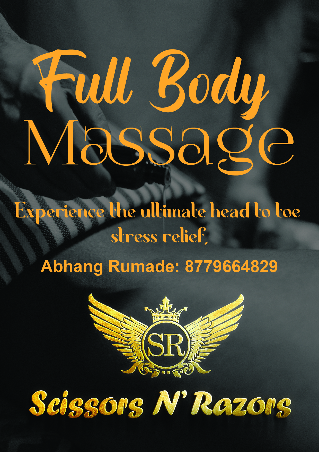
Table Standee
In-salon table standee promoting premium services — designed in the brand's signature black and gold language.
Foil-embossed black card with gold typography — a first impression that lingers.
SR crest on matte black mug — client-gifting and retail merchandise.
Embroidered SR crest on a structured black cap — uniform identity with luxury feel.
Premium stationery — A4 letterhead with foil-print header for formal client communication.
Screen-printed black uniform — every team member is a walking brand ambassador.
Every asset, file, and deliverable handed to the client as a complete brand kit.
A brand that opened doors from day one — before a single ad was placed.
Your brand deserves a presence that commands the room. Let's build something remarkable — from the first sketch to the final launch, we handle everything.
Social Media System
A consistent, scroll-stopping content system that builds brand equity with every post.