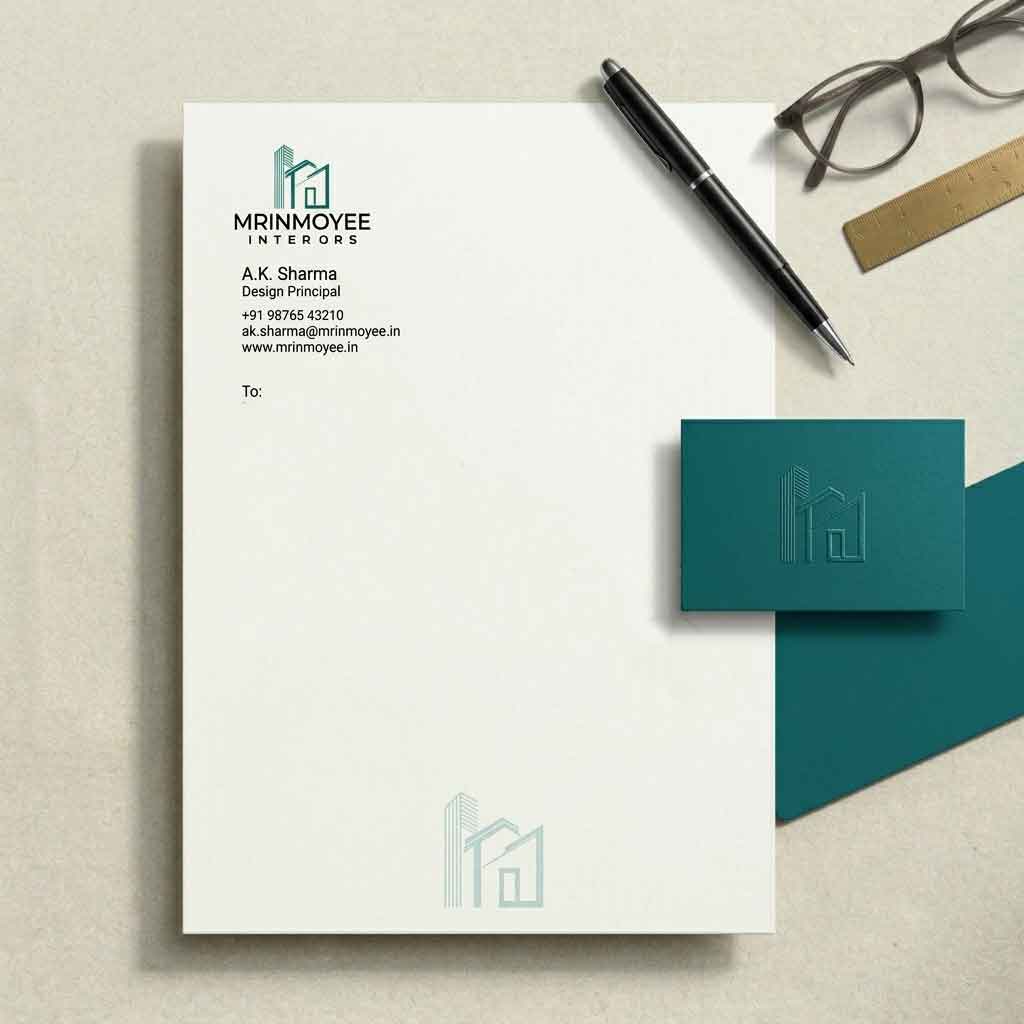
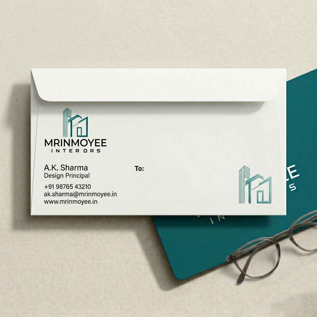
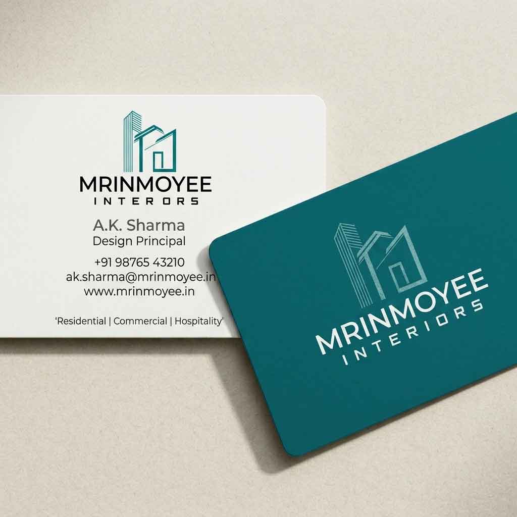
DRSHYTEC Solutions built a complete brand universe for Mrinmoyee Interiors — from architecture-inspired logo to stationery, packaging, mockups, and a responsive digital presence.
Mrinmoyee Interiors approached us as a growing interior design studio seeking to establish a credible, premium presence in a competitive market. The founders needed more than a logo — they needed a cohesive brand story.
"We wanted something that looked like architecture felt — precise lines, open space, the feeling that someone really thought about every corner."
— Mrinmoyee Interiors, FounderEvery brand decision was rooted in the language of architecture — structure, proportion, negative space, and material quality.
Deep-dive into the interior design industry, competitor brands, and the founder's vision. We mapped aspirations, audience personas, and positioned Mrinmoyee in the premium-accessible tier.
We curated visual references across architecture photography, interior portfolios, and typographic studies to establish a clear aesthetic direction before a single logo sketch was drawn.
Hand sketches explored architectural forms — buildings, rooflines, doorways, and the iconic "M" letterform. Over 30 concepts were generated before narrowing to 3 refined directions.
Selected concepts were digitized in vector software. We refined proportions, stroke weights, spacing, and tested the mark across sizes from 16px favicons to large-format signage.
The approved logo became the seed for a full system — color palette, typography hierarchy, pattern, icon style, and usage rules documented in a comprehensive brand guideline.
Stationery, packaging concepts, merchandise mockups, and the website were all designed and delivered. Print-ready files and web assets were handed off with source files included.
Before drawing a single line, we defined what the brand should feel like — structured yet warm, modern yet enduring.
We began with paper — exploring the overlap between the letter M and architectural forms. Buildings, rooflines, doorways, and spatial perspective became our visual vocabulary.
The final logo pairs an architectural building illustration with bold geometric typography — versatile enough for business cards and large signage alike.
Building forms referencing both commercial and residential interior spaces
Bold condensed letterforms — confident, modern, and highly legible
Tracked uppercase "INTERIORS" — precise, professional, architectural
The icon stroke color — energy, sophistication, and modern warmth
Five carefully chosen colors that work in harmony across every surface — from business cards to digital screens.
Two typefaces. One serif that carries the elegance of interior spaces. One sans-serif that delivers information with architectural clarity.
Print collateral designed with the same precision as the logo — consistent brand language across every piece of paper a client might touch.
A complete brand system, production-ready and documented — built for a studio ready to grow.
Let DRSHYTEC Solutions craft a complete brand identity for your business — from logo to packaging to a responsive website. Every detail, every surface, every touchpoint.